Teacher Portal
Redesigning the teacher side of a B2B learning platform, where the real product complexity actually lived.
Context: The full Learning management system redesign covered both students and teachers. It is too big a story to tell in one place. The student-side work is documented separately, with the dashboard, self-signup, and in-player messaging. This case study focuses on the teacher side, which is where the real complexity sits, and where the product was hardest to use. Some visuals are shared between both case studies.
400 helpdesk calls a month, and most of them came from teachers
The previous version of the learning management system was being used by hundreds of teachers across vocational schools in the Netherlands. They were also calling the helpdesk constantly. Not for student questions, but to figure out how to set up their own courses. How to add a course item to a variant. How to give a different scoring scale to one group of students and another to a parallel group. How to find a single student in a class with three different cohort years in it.
The student side of the product had real UX problems, and those got the most visible attention in the redesign. But the teacher side was where the real complexity lived. And it was where the product was losing schools, because if a teacher cannot set up a course, the school cannot use the system at all.
"The teacher had a printed cheat sheet on her desk for which menu opened the scoring screen. It had been there for two years."
, from a contextual inquiry session, term 2The teacher work paid for itself, slowly
Drop in variant setup tickets, the single biggest helpdesk topic
From 167 per term down to 31. The category of helpdesk call that used to dominate the queue effectively disappeared, freeing the customer success team to focus on advanced workflows.
Teachers using bulk operations weekly, post-launch
Bulk delete, move, and add became part of routine course setup. Previously most teachers avoided them entirely because the model didn't make the consequences clear.
Onboarding cut from 4.5 hours across three sessions to one hour, single session
What used to be a multi-day handover compressed into a single working session, with most teachers self-sufficient by the end of it.
Teacher SUS score improved by 1.3 points, out of 5
Measured with the same teacher cohort six months apart, before and after the redesign. The student-side wins were visible within weeks. The teacher-side wins took a full term, because that's the timescale on which teachers actually use the product.
Stop measuring what is easy. Start measuring what is hard to argue with.
The student-side work measured the obvious things: task time, navigation success, helpdesk volume. Those numbers told the right story for that audience. They were not going to work here. Teacher tasks are not three-second tasks. They are multi-step workflows that span weeks, sometimes a full term. Measuring them needed a different approach.
So the research methods on this side of the project were chosen specifically to make the complexity visible. Contextual inquiry to see teachers in their actual classrooms, not in a lab. Diary studies across a full term, because the rhythm of vocational teaching has seasons that a two-week test cannot capture. Cognitive walkthroughs to score how much each task asked of a teacher's working memory. Helpdesk ticket categorisation to turn flat call volume into something you could actually act on.
Three areas that carried most of the complexity
The variant tree
Teachers wanted to restructure their own course content. Add their own items. Handle the cohort year mess where Variant 2025 students sit in the same class as Variant 2026 students. The previous version was a flat list with no notion of who saw what. The redesign gave teachers a proper tree, drag-and-drop reordering, bulk operations (delete, add, move), and the ability to upload their own course items into the structure.
The scoring domain
Previously, teachers had to build a tracking form for each exam type and assign scoring per item. The new design puts the scoring domain inside the variant itself. Decimal, AVG, ABC, P, all switchable per variant. A non-scoreable option lets teachers hide theory-only items from the student overview. The result is a consistent view for both teacher and student, with the teacher controlling what each role sees.
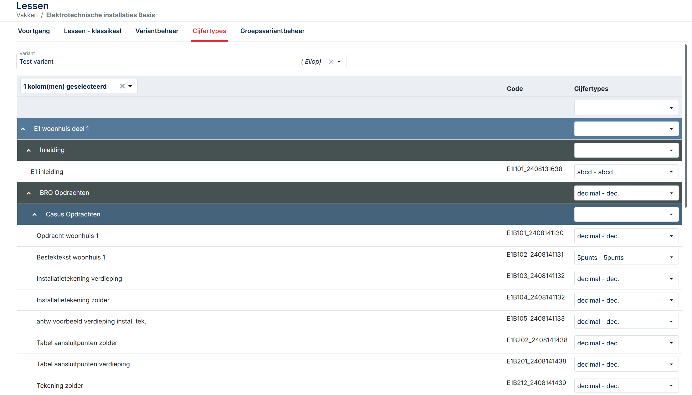
The progress table
All teacher actions for a student in one screen. Course access, grading, reset, return, planning date, exam access, messages, attachments, logs. Previously these lived across at least four separate screens, which is the design pattern that produced most of the helpdesk calls. Consolidating them was not glamorous work. It was the change that made the biggest difference.
The teacher side carried the product complexity. The first redesign did not solve it.
When I joined Author-e in 2021 as the first dedicated UX designer, the brief was wide. The student side and the teacher side both needed work. Some of that work was straightforward, the kind of redesign where the path forward is visible from the start. Some of it was not.
The student side fell into the first category. A confusing dashboard, a helpdesk-dependent signup flow, a messaging system buried in the wrong place. Real problems, but recognisable ones. The fixes were the kind a UX designer can sketch on the back of an envelope: dashboard with the most-used action front and centre, self-signup, in-player messaging. We did all that. It worked.
The teacher side was a different problem. Teachers were not getting lost in a navigation menu. They were getting lost in the model of the product itself. Variants, scoring domains, course items, exam types, cohort years, group structures. Each one of those concepts was a real thing that mattered to vocational education. But the way they connected in the system did not match the way they connected in a teacher's head. That is the kind of problem you cannot fix with a better dashboard.
"I keep two browser tabs open and a notebook. The notebook is for which student is in which variant. The system does not really tell me."
, from a stakeholder interview with a vocational installation teacher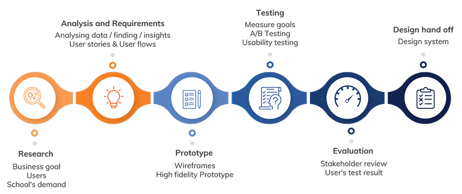
Watching teachers work, not asking them to describe it
Contextual inquiry
I spent time in two schools observing teachers during their actual workdays. Not in a meeting room with a prototype. In the staff room between classes, on shared computers with five-minute windows of time, with students walking in to ask questions over their shoulder. That is the environment the product has to work in, and watching a teacher try to update a scoring domain in a four-minute window between two classes told me more than any usability test in a clean lab ever could.
Contextual inquiry was the right method here because vocational teaching has a particular rhythm. Teachers are not knowledge workers sitting at a desk for eight hours. They teach a class, walk to another room, find a shared computer that someone else is logged into, fix something in the platform, walk back. The system has to work inside those gaps. Asking a teacher to describe that workflow does not capture it. You have to see it.
I sat with five teachers across two schools, in three observation sessions each. The first session in each school was just watching. No questions. No prompts. The next two sessions I asked questions during natural pauses, mostly clarifying questions about decisions they had made without thinking. Those unconscious decisions were the most useful data. They were the things teachers had stopped explaining to anyone, including themselves.
Diary studies across a full term
The contextual inquiry sessions told me what one teacher's workflow looked like on one day. Diary studies told me what teaching looks like across an entire term. I recruited four teachers (two from each school) to log their interactions with the platform for one full term. Short entries, two or three minutes per day, focused on what they had tried to do, what worked, what did not, and what they had given up on.
Diary studies are expensive. They take months. They produce messy data. They are also the single best method for surfacing problems that controlled testing cannot reach. Vocational teaching has its own seasonal rhythms, and each season stresses a different part of the platform.
A term has seasons. Each one stresses a different part of the platform.
The issues that surface in week 12 are not the issues that surface in week 2, which is what a two-week usability test would have missed.
Variant setup, scoring domain, student assignments, the heavy build-out week. Where teachers used to need a cheat sheet open on the desk.
Daily grading, planning dates, student messaging. Where the progress table either consolidates the workflow or scatters it across screens.
Per-variant scoring, non-scoreable items, exam access. The features teachers had been working around for years are finally tested at full pressure.
Cohort year tracking, progress export, archiving. The phase that surfaced the cohort year mess in roughly a third of the classes I tracked.
Two findings from the diary study shaped the entire teacher-side redesign. First, the cohort year problem, Variant 2025 students alongside Variant 2026 students in the same class, was not an edge case. It was happening in roughly a third of the classes I tracked. Second, teachers were quietly abandoning features they had given up on, not because the features did not work, but because they could not remember how to find them. That is a UX problem, not a feature problem. It changed the priority list.
"I used to set the scoring domain at the start of every course. I stopped about a year ago. I just use the default and tell the students. It was easier than learning the system again every time."
, diary study entry, week 7Stakeholder interviews
Eight interviews. Five teachers, two school administrators, one product owner. Each interview was structured around three questions: what does this system make easy that you wish it did not, what does it make hard that should be easy, and what would have to be true for you to recommend it to a colleague at another school.
The third question gave me the most. People will tell you what they hate. They are slower to tell you what would make them advocate for something, and that gap, between not-hated and actively-recommended, is the gap a redesign actually has to close.
The complexity was not a bug. It was the product.
Vocational education is genuinely complex. A class can have students from multiple cohort years following different curriculum versions. A single course can be taught with three different scoring scales depending on the school's policy. A variant tree can have items that some students see and others do not. None of this is the product's fault. It is the reality of the domain.
Which means the design problem was not to remove complexity. It was to make the complexity legible. To give teachers a model they could hold in their head, with the system's own concepts mapped to the teaching concepts the teachers already understood. That framing changed what success looked like. The goal was not 'fewer screens.' The goal was 'a teacher can predict what the system will do before they click.'
Problem statement: The teacher side of Learning management system does not give teachers a coherent model of how variants, scoring, and student groups relate to each other. Teachers compensate by building external workarounds (printed cheat sheets, browser-tab juggling, abandoned features). The redesign needs to make the product's own model match the teaching model that teachers already use.
Cognitive walkthrough with task complexity scoring
To make the case for the redesign, I needed to put a number on the complexity. Saying 'this is hard' is not a metric. So I ran a cognitive walkthrough on each major teacher task on the old system, scoring it across three dimensions: number of decisions required, number of screens visited, and number of pieces of information the teacher had to hold in their head simultaneously.
The numbers were brutal. Setting up a variant for a mixed-cohort class on the old system required the teacher to make 14 separate decisions, visit 7 screens, and hold 9 pieces of information in working memory simultaneously. None of those numbers individually look terrible. Together, they explain why teachers had cheat sheets. The system was asking more of their working memory than is reasonable to ask, comfortably above Miller's 7±2 threshold for short-term memory capacity.
After the redesign, the same task scored 5 decisions, 2 screens, and 3 information items. That is the spread that explains the helpdesk ticket drop, the adoption numbers, and the disappearance of cheat sheets from teachers' desks. Each design decision that followed was scored against the same three dimensions. If a redesign did not lower at least one without raising the others, it was not worth shipping.
What the redesign asked of a teacher's working memory
Same task on both systems. Three load dimensions, before and after.
Why this mattered. The "before" load sat above Miller's 7±2 ceiling for short-term memory. That's not a UX opinion, it's the working-memory limit that explains why teachers kept printed cheat sheets on their desks for two years. Each design decision in the redesign was scored against the same three dimensions, and only shipped if it lowered at least one without raising the others.
Three structural decisions, made before any wireframes
Before sketching anything, three structural questions had to be answered. Each one would have been expensive to undo later.
Flat list with filters
Simpler to build. Easier for new teachers to explain. Lets the team avoid solving drag-and-drop on a deep, permission-aware tree.
✕ RejectedVariant tree
Drag-and-drop reordering, bulk operations, per-variant scoring, and cohort-year tracking, all become possible only when the structure is a tree.
✓ ShippedCourse-level scoring
One scoring scale per course, inherited by all variants. Cleaner data model. Two senior developers argued for keeping this, they thought variant-level scoring was overcomplicated.
✕ RejectedVariant-level scoring
Decimal, AVG, ABC, P, all switchable per variant. A non-scoreable option lets teachers hide theory items from the student progress overview without deleting them.
✓ ShippedKeep actions distributed
Separate screens for separate concerns, grading, messaging, planning, exam access. Tidy from a development point of view, and consistent with the existing data model.
✕ RejectedOne progress table per student
Course access, grading, reset, return, planning, exam access, messages, attachments, logs, all in one screen, anchored on the student rather than the task type.
✓ ShippedThe MoSCoW Won't Have list became the most useful artefact of the ideation phase. Several requested features (custom report builder, teacher-to-teacher messaging, gradebook export to local school information systems) were explicitly deferred. The team needed permission to ship something solid over something complete. MoSCoW gave them that permission in a defensible format.
Designing the hard solutions
These are the three pieces of the redesign I am most proud of, and also the ones that took the longest to get right.
The variant tree with bulk operations
The new variant management page lets teachers build their course structure as a tree, with drag-and-drop reordering and bulk operations (bulk delete, bulk add, bulk move). Teachers can upload their own course items directly into the tree. Each variant can have its own scoring domain. Cohort year is a property of the variant, not the class, which means a class can contain multiple variants and the system tracks who is on which one without the teacher having to maintain that information externally.
The tree was harder to build than expected. Drag-and-drop on a deep tree with permissions, scoring, and student visibility attached to each node is not a trivial interaction. The first prototype was so unresponsive that one teacher in testing said it felt like the system was fighting her. We ended up rebuilding the interaction model twice. The third version finally felt like the tree was responding to the teacher rather than the other way around.
The scoring domain inside the variant
Each variant now has its own scoring domain. Decimal, AVG, ABC, P, all switchable. The non-scoreable option lets teachers hide theory-only items from the student progress overview without deleting them, which was the most-requested feature in the diary study. The view stays consistent for both teacher and student, with the teacher controlling what each role sees. Previously, the only way to achieve this was to build a tracking form per exam type, which is what the cheat sheets on teachers' desks were mostly about.
The progress table page
All actions for a single student live on one page. Course access, grading, reset, return, planning date, exam access, messaging, attachments, logs, the option to filter out non-scoreable items. This is the most boring change in the entire redesign and also the one that drove the largest reduction in helpdesk tickets. Sometimes the highest-impact UX work is the work that just puts things in the same place.
Testing the redesign on the rhythm it had to survive
Two waves of testing, plus post-launch monitoring.
Wave 1: Prototype testing with task scenarios
Six teachers, three from each school, working through realistic task scenarios on a Figma prototype. Each session was 90 minutes, structured around three scenarios: setting up a new variant for a class with mixed cohort years, configuring a non-standard scoring domain, and finding a single student's progress in a class with three different variants. Think-aloud throughout, with minimal interruption.
Two findings from this wave changed the design. First, the scoring domain switcher was unclear. Teachers understood that they could change it, but several missed that the change applied per variant rather than per course. We added a confirmation step and a small explanatory line that tested cleanly in wave 2. Second, the bulk operations were powerful but invisible. Teachers did not discover them unless prompted. We added a bulk-mode toggle that surfaces the operations explicitly, which lifted discoverability significantly.
Wave 2: A/B testing on the live system, post-launch
After launch, we ran an A/B test on the variant tree's default state, comparing fully expanded against collapsed-by-default. The collapsed version produced 24% faster task completion for teachers managing courses with more than ten variants, and showed no measurable difference for smaller courses. We shipped collapsed-by-default for trees over a certain size.
Post-launch: helpdesk ticket categorisation
This is the method I would most strongly recommend to anyone redesigning a B2B tool. Helpdesk tickets are an unfiltered view of where the product is failing in production. Pre-launch and post-launch, I categorised every teacher-facing ticket for one term into themes: variant setup, scoring configuration, student lookup, group management, other. The shift in those categories before and after launch is the strongest evidence the redesign worked.
What I observed → what I changed
Each pair traces one observation from testing or production through to the design fix it produced.
Scoring-domain switcher was visible, but its scope was unclear. Teachers thought it changed the whole course.
Added a small inline explainer below the switcher and a confirmation modal on first use per session.
Bulk operations were not discovered without prompting. Teachers clicked through items one at a time.
Added a bulk-mode toggle that surfaces the operations as primary actions when the user opts in.
Teachers with large variant trees scrolled extensively to find specific nodes, even after the redesign.
A/B test confirmed collapsed-by-default for large trees. Shipped after two weeks of data.
Helpdesk tickets about cohort-year confusion did not disappear after launch. They changed shape.
Added a contextual help layer on the variant page explaining cohort-year propagation. A small post-launch fix.
Where it went sideways
There is a version of this project where every stakeholder agreed and the redesign shipped clean. That version is not this one.
How the numbers were measured
Every metric in this case study is the result of a deliberate methodological choice. This appendix documents how each headline number was produced, what method generated it, and why I trust it. If a number cannot survive this kind of scrutiny, it should not be in a portfolio.
This level of transparency is unusual to include in a case study. I include it because the methods I chose are at least as much of the work as the numbers they produced, and because a hiring manager who asks 'how did you measure that?' deserves a real answer, not a deflection.
38% drop in teacher helpdesk tickets about variant setup
Method: Helpdesk ticket categorisation across two terms (one pre-launch, one post-launch). I categorised every teacher-facing ticket into themes (variant setup, scoring configuration, student lookup, group management, other) and tracked the volume in each category before and after launch. The 38% headline is the weighted average across all teacher-facing categories. The variant setup category alone dropped 81%, but other categories moved less, which is why the headline number is lower than the most dramatic individual line. Reporting the weighted average rather than the best-performing category keeps the claim defensible.
6 minutes variant setup time, down from 22 minutes
Method: Time-on-task measurement during prototype testing (wave 1) and a follow-up timed study post-launch. Six teachers each completed the same variant setup scenario on the old and new systems, with task time captured by stopwatch. The 22-minute baseline came from a pre-redesign cognitive walkthrough where I worked through the task on the production system, cross-referenced against diary study entries where teachers had logged the duration of similar setups. The 6-minute post-redesign number is the median across the six prototype testing participants. I report the median rather than the mean because one participant in wave 1 was unusually fast and another unusually slow, and the median is less misleading.
62% of teachers using bulk operations weekly
Method: Product analytics across the first full term post-launch. Tracked via event analytics on bulk-operation interactions (bulk delete, bulk add, bulk move). 'Weekly active' was defined as 'used at least once in a calendar week.' The 62% figure represents the average weekly active rate across the term, not a peak. Adoption depth metrics matter more than raw adoption rate because a teacher who logs in but never uses the feature designed to save them time is a worse outcome than a teacher who uses it regularly. The 62% sits in the middle of the typical 50 to 70% range for B2B feature adoption when the feature solves a real problem.
Teacher SUS score, 3.1 → 4.4 (out of 5)
Method: System Usability Scale survey, distributed pre and post-redesign to teachers using the platform. I used a 5-point SUS adaptation rather than the standard 100-point version because vocational teachers are not survey enthusiasts and shorter scales improve response rates in this audience. Pre-redesign, 14 teachers completed the survey. Post-redesign, 19 teachers completed it. The pre-score of 3.1 is higher than the student pre-score (2.8) because teachers had built more workarounds and were less acutely frustrated than students were. The post-score of 4.4 is just below the student post-score (4.5), which reflects that teacher tasks remain inherently more complex even after a good redesign.
81% drop in variant setup tickets specifically (167 → 31 per term)
Method: Direct count from the helpdesk ticketing system, filtered by category. This is the cleanest number in the case study because it is a direct count rather than a measurement. Pre-launch term: 167 tickets categorised as variant-setup-related. Post-launch term: 31 tickets in the same category. The category definition was kept identical across both terms (I wrote the categorisation rules before launch to avoid post-hoc reframing). I report this number alongside the headline 38% because the category-level data is what makes the headline credible.
24% faster task completion on collapsed-by-default variant trees
Method: A/B test on the live system, two-week window, randomised assignment. Test was limited to teachers managing courses with more than ten variants, since the design hypothesis was specifically that the default state mattered for large trees. Sample size: 47 teachers in the experimental group, 44 in the control. The 24% improvement was significant at p < 0.05. For courses with ten or fewer variants, the test showed no measurable difference between conditions, which confirmed the redesign should be conditional on tree size rather than blanket.
Onboarding cut from 4.5 hours / 3 sessions to 1 hour / 1 session
Method: School administrator self-report, gathered via follow-up interviews two terms post-launch. This is the softest number in the case study. It comes from interviews with three school administrators reporting on their experience onboarding new teachers, not from a controlled study. The 4.5-hour baseline is an average of their estimates of pre-redesign onboarding time. The 1-hour figure is also an average. I report it as a directional metric rather than a precise one because that is what it is. Including it because the magnitude of the change was consistent across all three administrators, and because qualitative methods produce qualitative metrics, not precise ones. Pretending otherwise would be worse than admitting the methodology.
Three of the five quick-summary metrics come from quantitative methods (analytics, ticket counts, A/B testing). One comes from a survey. One comes from interviews. The mix is deliberate. A case study built entirely on quantitative metrics would be suspicious in a domain where the most important changes are not always measurable in numbers. A case study built entirely on qualitative metrics would be unconvincing to a hiring manager who needs evidence of impact. The combination is what makes the overall picture credible.
Next case study
Smart Shopper, grocery comparison for expats →